Now, a lot of designers make a big fuss about television sets. Some labor under the impression that people don’t watch TV all the time; they insist that chairs should be arranged facing one another to create conversation, or perhaps pointing toward a feature such as a fireplace or a large window. If there is a TV in the room, it should be hidden somehow and only pulled out on those rare occasions when you are not entertaining guests.
Whatever!
Watching TV or movies is probably what we all do most in our living rooms, so why hide it? However, it can’t just sit on the floor so we do need to put it on something.
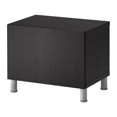
Originally Brian and I had a basic tube TV (you know, the kind that isn’t flat) and it sat on top of an end table. Not the most attractive set-up, especially with the DVD player and all the cords and stuff just hanging out in a heap underneath. Eventually, we began to buy things, and we upgraded to a small $70 TV stand from Ikea that looked like this:
We liked it for its no-fuss design. Just a box on legs, really, and inside the cupboard was a place to put all our TV components. Plus, all the many cords and cables were hidden from view. Unfortunately, there was one major drawback: the cupboard door had to be left open if you wanted to use the remote.
So when we moved to our current apartment, we upgraded to a flat-screen TV that we bought from a friend for just $200 dollars. A new TV seemed the perfect excuse for a new entertainment center. Our new apartment also had a much longer wall, and I immediately envisioned a giant monster of a storage unit. I could see one with sliding doors to cover the TV when not in use, and plenty of shelves and cupboards and things to store our movies or display our things. Maybe it could be lighted, or have some sort of water feature…
Well, those kinds of media solutions are really expensive. And in case you don’t know, we are very poor! This is design on a dime, folks! So I began to rethink the whole matter. We already had a shelving unit where we had our DVDs aligned:
So I thought, what if I can just buy another piece from the same collection and put them together? So I got online and found just the perfect thing:
But, this is where I got a little creative. I used it laying flat, and not standing tall. Sometimes, finding the perfect storage solution is thinking outside the box. We are very happy, with how our TV is set up. It simply sits on the top of one end, and next to it, we placed that body pillow I mentioned in the previous article. It fit perfectly on top, provides an additional seating area, but it also covers up all the cords! That’s right, behind that pillow is the outlet where all our TV components get plugged in.
In the five squares below the TV/bench, we have our TV components (no doors to get in the way of our remote control) and all our DVDs in alphabetical order. Butted up right against the long shelving unit is our original unit, housing books and knickknacks, with decorative items on top. I really love the long, low, and sleek look the two pieces create, and they fit the length of our wall perfectly. We couldn’t be happier.


No comments:
Post a Comment